Worktrees — Building Three Visualizations in Parallel

Article 6 · Series: Agentic Coding with Claude Code
v0.5 delivers a consolidated Parquet, 377 line items, a manifest. But no picture. How do you represent hierarchical budget data visually? Three plausible answers: treemap, sunburst, Sankey. Building sequentially means waiting three days and accepting one variant at the end because you have already spent three days on it. Git worktrees solve this differently.
Worktree, Branch, or Stash
Three tools, three contexts. The distinction:
- Stash — short-term context switch, not repeatable. For “I just need to check something else quickly”.
- Branch + Checkout — sequential work on alternatives. For bugfixes, features, normal iteration.
- Worktree — several branches simultaneously in the filesystem. Each with its own
node_modules, its own dev server, its own browser tab.
A worktree pays off when parallel visibility is valuable. Three visualization variants that only become comparable in the moment they run simultaneously are exactly this case. For a bugfix branch that gets merged in 10 minutes, a worktree is overhead.
Plan File for the Frontend
Four tasks, three of them parallelizable:
Task 1 (sequential): web/ skeleton on main
  Vite + React 19 + TypeScript + Tailwind 4 + Vitest
  data loader, shared component layer

Task 2a (parallel): frontend/treemap
Task 2b (parallel): frontend/sunburst
Task 2c (parallel): frontend/sankey
  one component each, one smoke test each

Task 3: visual comparison + decision
Task 4: tag v0.6
The briefing per variant is minimal: one component, one smoke test, the shared data.ts from Task 1 as input. The three subagents receive the same dataset and the same schema definition.
Task 1 — Skeleton on main
Create web/ skeleton on main:
- Vite + React 19 + TypeScript
- Tailwind 4 via @tailwindcss/vite (no separate config file)
- Vitest + @testing-library/react + jsdom
- d3 + d3-sankey
- data.ts: useHaushalt() hook loads /data/haushalt.json and /data/manifest.json
- types.ts matching HAUSHALT_SCHEMA from parser/
- scripts/copy-data.mjs: copies parser/output/{haushalt,manifest}.json to public/data/
- predev + prebuild hooks call copy-data.mjs
Claude Code creates the files, npm install runs, npm run dev starts on port 5173. The skeleton renders the title count and the manifest but still no visualization yet.
This way every following worktree starts from the same data layer. data.ts is the only place allowed to load JSON and turn it into hierarchies. The components are pure renderers.
Opening Three Worktrees
git worktree add ../byhaushalt-treemap   -b frontend/treemap
git worktree add ../byhaushalt-sunburst  -b frontend/sunburst
git worktree add ../byhaushalt-sankey    -b frontend/sankey
Those three commands produce three isolated directories on disk, each on its own branch, the main working directory in byhaushalt/ left untouched. git worktree list shows the current state:
/Users/.../byhaushalt           [main]
/Users/.../byhaushalt-treemap   [frontend/treemap]
/Users/.../byhaushalt-sunburst  [frontend/sunburst]
/Users/.../byhaushalt-sankey    [frontend/sankey]
npm install once in each worktree, with separate node_modules per directory. That costs disk space, but it is the prerequisite for three dev servers running at the same time.
cd ../byhaushalt-treemap/web  && npm install && npm run dev -- --port 5173
cd ../byhaushalt-sunburst/web && npm install && npm run dev -- --port 5174
cd ../byhaushalt-sankey/web   && npm install && npm run dev -- --port 5175
From here three terminals run in parallel. Each starts npm run dev on its own port, each opens a browser tab with the same dataset. Only now does comparison become possible, not from memory, but side by side.
Three Visualizations, One Data Layer
One Claude Code prompt per worktree:
Create a treemap component in web/src/charts/.
Each Einzelplan should become a rectangle, area = expense total.
Please add a simple test as well.
Create a sunburst component: Einzelpläne on the inside, main groups on the outside.
Revenue in red, expenditure in teal. Test included.
Create a Sankey component: Einzelpläne as nodes, main groups as targets.
Flanking tables left and right for reference. Test included.
Claude Code writes the component and the smoke test per worktree. npm run test in each worktree: 2 tests passing.
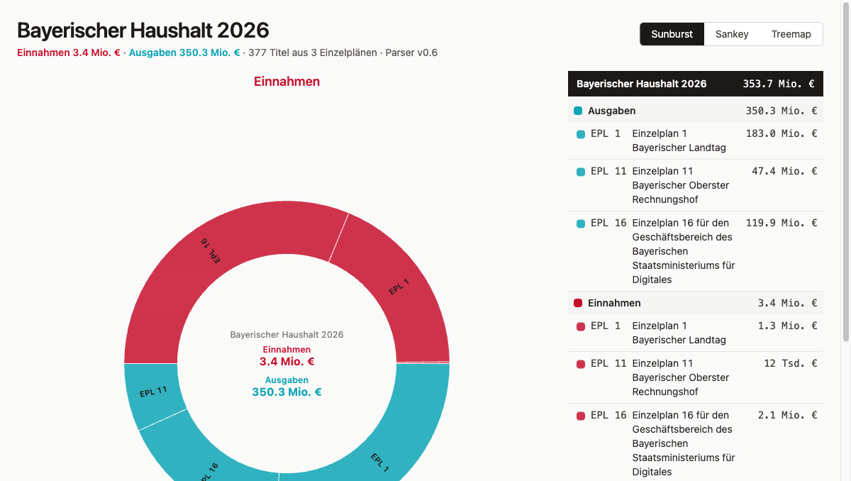
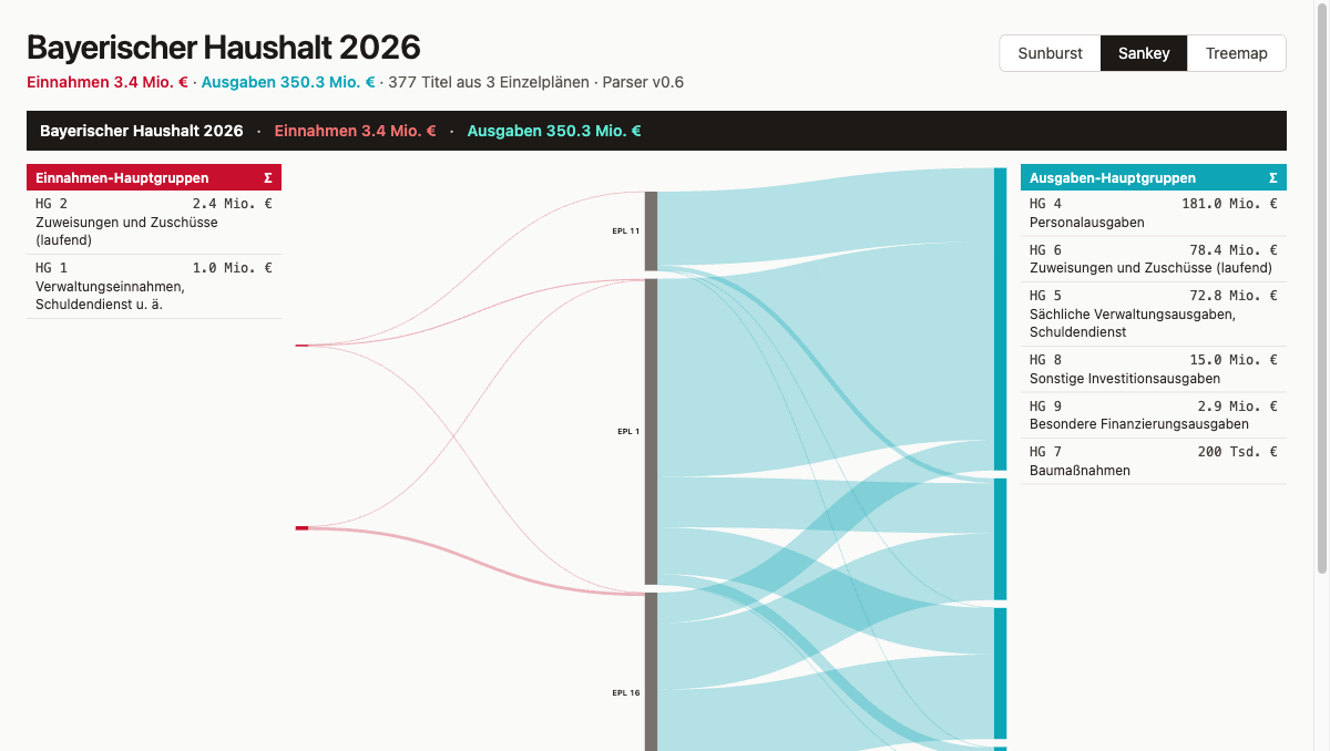
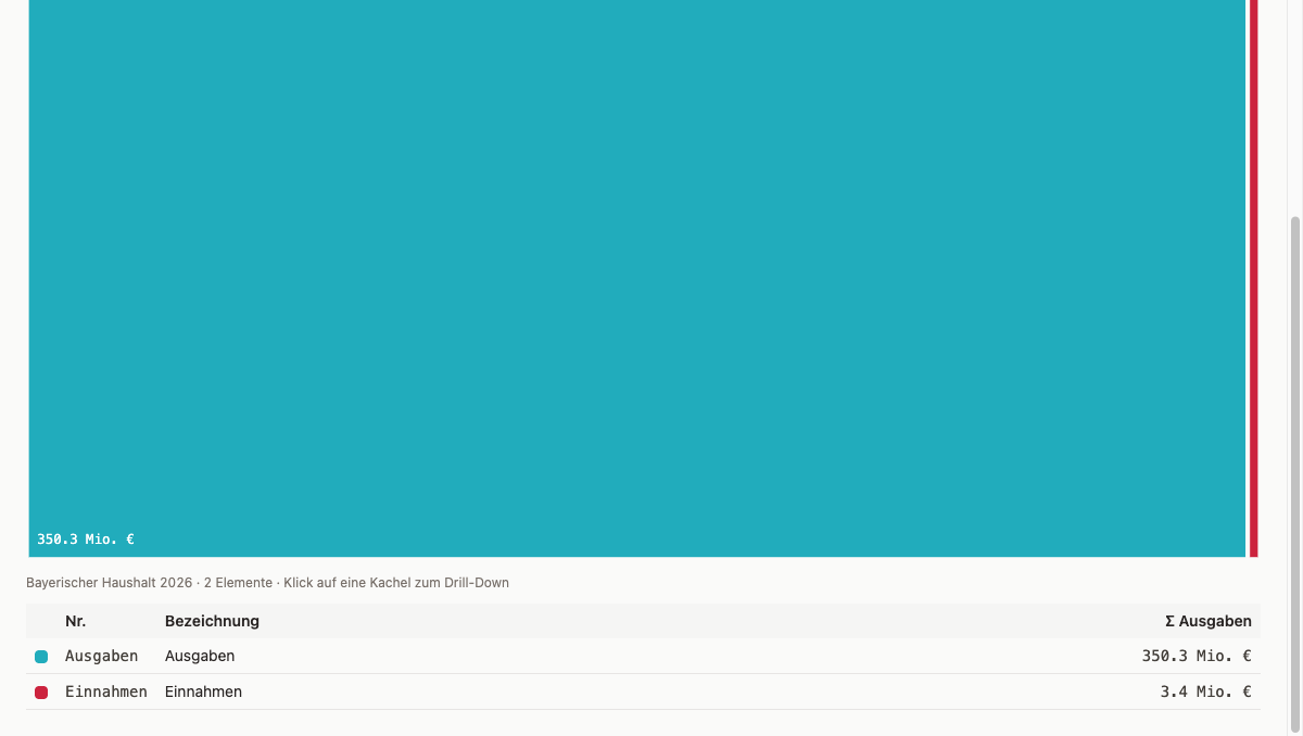
The treemap makes size relationships visible. Each Einzelplan becomes a rectangle whose area corresponds to its expense total. You can see immediately which EPL dominate the budget and which barely register. The sunburst shows the same data hierarchically: the inner ring holds the Einzelpläne, the outer ring breaks each one down into its main groups. Hierarchy and proportions are readable at the same time. The Sankey follows a different logic: nodes are Einzelpläne and main groups, edges are the money flows between them. Anyone who wants to trace where a specific revenue type ends up, or which expenditure category is fed from which EPL, just follows the lines.
In the comparison phase, one smoke test per variant is enough: Vitest with jsdom renders the SVG and checks that the data-testid element exists, that rect and path nodes are present. That is all. Testing three variants deeply too early means optimizing one before knowing whether it survives.
Iterations During the Comparison
The interesting decisions did not come from the plan file. They came from the browser tab, because visualizations can only really be evaluated once you see them. A plan describes what should be built; the browser shows whether it works, whether it is readable, and whether it answers the right question. In each variant, problems surfaced that could not have been fully specified in advance.
EPL Names Instead of Numbers
When the first version runs in the browser tab, the problem is immediately visible: the label reads “EPL 11” and says nothing at all. “Einzelplan 11 Bayerischer Oberster Rechnungshof” is what stands in the PDF, but the parser had only extracted the number, not the name behind it. The prompt to fix that:
Extend the parser so it reads the name of each Einzelplan and chapter
from the PDF and saves it. The name is right there in the PDF header.
Two fields added to the schema (epl_name, kap_name), parser re-run, normalize.py writes new JSON, git merge main in all three worktrees and data regenerated. From that point on every Einzelplan carries its full name. The code change in the parser:
# parser/src/parser/pdf_extract.py
_RE_KAP_HEADER = re.compile(r"^(\d{2})\s+(\d{2})\s{2,}(\S.*?)\s*$")

def _extract_epl_name(lines: list[str]) -> str:
    """Searches for 'Einzelplan XX' and collects the following non-empty lines
    as EPL name (multi-line possible, e.g. Epl16)."""
    ...
Main Groups Instead of Chapters
The first drill level under each EPL was: Kapitel (chapter). In the browser it became clear that this is the wrong level of abstraction. Chapter names like “Landtag” or “Sammelansätze für den Gesamtbereich des Epl. 11” describe organizational units, not content categories; the question “what is the state spending money on” goes unanswered. The fix was to use the main-group classification from the German Federal Budget Code (BHO §13) as the drill level instead. Prompt:
The second level should not show chapters, but group by type of spending —
personnel, operating costs, investment, and so on.
That is the main-group classification in the federal budget plan, first digit of the title number.
The first digit of the title number determines the main group:
// web/src/hauptgruppen.ts
export const HAUPTGRUPPEN = {
  "0": { name: "Taxes and tax-like duties", kind: "einnahme" },
  "1": { name: "Administrative revenue, debt service etc.", kind: "einnahme" },
  "4": { name: "Personnel expenditure", kind: "ausgabe" },
  "5": { name: "Operating costs, debt service", kind: "ausgabe" },
  "7": { name: "Construction", kind: "ausgabe" },
  "8": { name: "Other investment expenditure", kind: "ausgabe" },
  // ...
};
The difference was immediately noticeable. The sunburst now showed: “Einzelplan 11” → “Personnel expenditure”, “Operating costs”, “Investment”. That is the information someone looking at a budget actually wants: not an org chart, but a content breakdown.
Revenue AND Expenditure
The first hierarchy filtered revenue main groups (0–3) out of the visualization entirely. Looking at the browser, the gap was obvious: a budget plan is not just about where money is spent — it also shows where it comes from. Both sides belong in the visualization. Prompt:
Remove the filter that only shows expenditure.
Revenue and expenditure should both be visible, distinguished by color.
Show the totals for each separately in the center.
With both kinds included and color-coded — red for revenue, teal for expenditure — the sunburst now shows both totals in the center. Clicking on an EPL arc shows its individual total. The logic is small:
const totals = summarizeTotals(titel); // { einnahmen, ausgaben }
// center label renders both values as default, EPL detail on selection
Sankey: Three Columns Instead of Two
The Sankey went through two iterations with the same underlying problem. First EPL → Kapitel, then EPL → main group — but in both cases the flow direction felt arbitrary. Money does not flow from the Einzelplan to a main group. The actual relationship goes the other way: revenue main groups feed into the Einzelplan, the Einzelplan feeds out into expenditure main groups. That structure calls for three columns. Prompt:
Change Sankey to three columns: revenue types left, Einzelpläne center,
expenditure types right. With tables on each side for reference,
clicking a row highlights the corresponding flow.
The resulting arrangement — revenue main groups left, Einzelpläne center, expenditure main groups right — makes the flow readable. Two flanking tables with code, name, and total highlight the corresponding flows in the Sankey on click.
Label Truncation and Center Hole
The last layout issue before comparison: long EPL names like “Einzelplan 16 für den Geschäftsbereich des Bayerischen Staatsministeriums für Digitales” simply ran out of the arcs. The fix was pragmatic — truncate to ~22 characters with ellipsis, and for arcs that are too narrow to hold even that, no label at all. At the same time the center hole got more space (INNER_HOLE = RADIUS * 0.33) so the center label could fit cleanly.
Beyond the Counted Iterations
The five iterations described here read more neatly than they actually were. Design decisions in practice sometimes require several passes on the same topic: the layout looks different in the browser than expected, the adjustment goes in the right direction but not quite far enough, and you correct again. What counts is the result — not the number of prompts it took.
Visual Comparison
Three browser tabs side by side, same dataset, three different answers. The treemap answers the simplest question in two seconds: which Einzelplan is the largest? Area is size, and that reads immediately. The sunburst answers something more nuanced: which main groups dominate within a given EPL, and how do revenue and expenditure distribute? The ring-based hierarchy makes that tangible. The Sankey follows a different logic — anyone who wants to trace a specific revenue type follows the line to the Einzelpläne and on to the expenditure categories.
Three questions, three visualizations. None of the three was clearly better — they were different.
Decision — No One Gets Discarded
Karpathy’s worktree workflow suggests: one wins, the others disappear. But: three visualizations answer three different questions. A forced choice would throw away two thirds of the information.
Decision: merge all three into main, switchable in the app.
// web/src/App.tsx
const VARIANTS = [
  { key: "sunburst", label: "Sunburst" },
  { key: "sankey",   label: "Sankey" },
  { key: "treemap",  label: "Treemap" },
];

const [variant, setVariant] = useState<Variant>("sunburst");

// <nav role="tablist"> with three buttons
// {variant === "sunburst" && <Sunburst ... />}
// etc.
Default selection: sunburst. Shows the most information at a glance. The other two are one click away.
The worktree branches frontend/treemap, frontend/sunburst, frontend/sankey are kept. They are the historical artifact of the comparison — anyone who wants to follow the iteration path can check out each branch in isolation.
Iterations After the Merge
The decision is made, the three branches are in main. The work does not stop there — the browser reveals things that were not visible during the worktree comparison.
Hierarchy One Level Deeper
First implementation: four levels root → EPL → Hauptgruppe → Titel. In the sunburst it was unclear when you would see revenue main groups versus expenditure main groups. Prompt:
In the sunburst it is not clear when you see revenue and when expenditure.
Add a level in between: first choose revenue or expenditure, then the Einzelpläne.
The solution: kind as its own level directly under root.
root → kind (revenue/expenditure) → epl → hauptgruppe → titel
Each kind node gets its own subtree. A click on “Ausgaben” shows exclusively expenditure EPLs — no mix.
Drill-Down via focusPath, Not via nodeKey
The problem was in the state design: after drilling into a sub-tree, the nodes there no longer had ancestors, and the walk-up landed at the wrong point. The symptom was clear — clicking an EPL after zooming into “Ausgaben” jumped back to the full view instead of going deeper. Prompt:
Bug: when I click on revenue, then click on an Einzelplan,
it jumps back to the full view instead of zooming in further.
The right fix was to stop using a composite string key and instead track the state as a path array, one identifier per drill step:
const [focusPath, setFocusPath] = useState<string[]>([]);

// On click: build local path from sub-root, append to existing path
const pathFromSubRoot: string[] = [];
let cur = clickedNode;
while (cur && cur !== subRoot) {
  pathFromSubRoot.unshift(identifierOf(cur.data));
  cur = cur.parent;
}
setFocusPath([...focusPath, ...pathFromSubRoot]);
Lesson: track drill-down state as a path array, not as a string key across sub-hierarchies.
Short Codes in the Graphic, Full Names in the Table
One step further and it became clear that truncating to 22 characters produces no useful label: “Einzelplan 11 Bayerisch…” says nothing. The better approach: the graphic shows only short codes, the companion table shows the full name with line wrapping. Prompt:
The long labels in the graphic do not work. Use short labels like EPL 1, HG 4 in the graphic,
and show the full description in the table next to it.
function shortLabelFor(data: HierarchyNode): string {
  switch (data.level) {
    case "epl":         return `EPL ${parseInt(data.meta?.nr ?? "0", 10)}`;
    case "hauptgruppe": return `HG ${data.meta?.nr}`;
    case "titel":       return data.meta?.nr ?? "";
    default:            return data.meta?.kind === "einnahme" ? "Einnahmen" : "Ausgaben";
  }
}
Sunburst Default as a Half-Circle Layout
The next layout problem appeared in the sunburst default view: two sectors, revenue and expenditure, sitting side by side in a full circle made it hard to tell which was which at a glance. The solution was a half-circle split: revenue on top, expenditure on the bottom, labeled by HTML headings outside the SVG. Prompt:
When you see revenue and expenditure next to each other in a full circle you can't tell
which side is which at a glance. Split the default view into two halves:
revenue on top, expenditure on the bottom.
Labels "Einnahmen" and "Ausgaben" outside the circle as headings.
When you click inside, show the normal full circle.
Two separate d3.partition calls with size([π, RADIUS]), then angle offsets:
// Revenue: upper half-circle [-π/2, π/2]
einnRoot.each((d) => { d.x0 -= Math.PI / 2; d.x1 -= Math.PI / 2; });

// Expenditure: lower half-circle [π/2, 3π/2]
ausgRoot.each((d) => { d.x0 += Math.PI / 2; d.x1 += Math.PI / 2; });
When zoomed (focusPath non-empty): full circle as usual. The labels “Einnahmen” and “Ausgaben” sit as HTML headings above and below the SVG, not inside the circle.
Colors Reassigned on Zoom
A color issue that only surfaced on zoom: in the default view, red and teal work well as kind-colors. But zoomed into “Ausgaben”, everything would be teal, with no way to tell one EPL from another. The solution on zoom is to switch to a Tableau ordinal palette, one distinct color per depth-1 child:
const isDefault = focusPath.length === 0;
const colorFor = (d) => {
  if (isDefault) return KIND_COLORS[d.data.meta?.kind ?? "ausgabe"];
  let n = d; while (n.depth > 1) n = n.parent;
  return ordinal(identifierOf(n.data));
};
Center Label Shows Both Totals
The empty center in the default view was the last visible gap: the sunburst showed revenue and expenditure, but nowhere was there a total. Three text lines in the center hole solved it: “Bayerischer Haushalt 2026” in grey, then Σ revenue in red and Σ expenditure in teal below it. On zoom the center switches to the name of the selected node, its total, and a clickable back signal that removes one step from the focusPath.
Companion Tables with Grouping
First table version: flat list. Requirement: grouped by parent element, sorted by EPL number. Natural sort via padded numeric portions:
function numericSortKey(data: HierarchyNode): string {
  return (data.meta?.nr ?? "").replace(/\d+/g, (m) => m.padStart(8, "0"));
}
Default table: header “Ausgaben” + all expenditure EPLs by number, then header “Einnahmen” + all revenue EPLs by number.
Treemap: Drill-Down and Text Wrapping
The first treemap showed two static panels with no drill-down and no navigation. Making it consistent with the sunburst meant adding the same focusPath logic and a breadcrumb header in the navigation. That was quick. The real surprise came with the text layout inside the tiles: SVG <text> does not wrap automatically, and longer EPL names became a problem immediately. Prompt:
Rebuild Treemap.tsx with focusPath drill-down (analog to Sunburst).
Header shows clickable breadcrumb path.
Text in tiles via <foreignObject> + HTML <div> (break-words, Tailwind),
because SVG <text> has no automatic wrapping.
Table below SVG with color code + shortLabel + name + Σ.
Same focusPath logic, same d3.treemap calculation. Header shows breadcrumb, every crumb is clickable.
Text in SVG does not wrap automatically. Solution: <foreignObject> with an HTML <div>, Tailwind break-words:
<foreignObject x={0} y={0} width={w} height={h}>
  <div className="text-white p-2 flex flex-col gap-1">
    <div className="font-bold">{shortLabel}</div>
    <div className="text-xs break-words">{fullName}</div>
    <div className="text-xs font-mono">{formatTsdEuro(value)}</div>
  </div>
</foreignObject>
Consistency Across All Three Variants
Prompt for Sankey:
Make the Sankey consistent with the sunburst and treemap:
same header at the top with total figures, short codes in the graphic,
tables with full labels next to it.
Keep the click-to-highlight behavior as it is.
Giving the Sankey the same header, the same short-code labels, and the same companion tables only took one prompt. The one deliberate difference: the Sankey keeps its click-to-highlight behavior rather than adopting the subtree filter from the other two. For a flow diagram, watching everything else fade is more informative than seeing only the selected subtree.
The result is three variants that look and feel like they belong together: one shared language of header, short codes, and companion tables, three different answers to three different questions.
Status at the End of This Article
git clone https://codeberg.org/rotecodefraktion/byhaushalt.git
cd byhaushalt
git checkout v0.6
cd parser && uv run python -m parser.normalize
cd ../web && npm install && npm run dev
Full state at byhaushalt @ v0.6.
v0.6 contains: web/ skeleton with Vite + React 19 + TS + Tailwind 4 + Vitest, three visualization components in web/src/charts/, switcher in App.tsx, parser extended for epl_name + kap_name, main-group classification in web/src/hauptgruppen.ts. 22 tests passing, 3 xfailed.
cd parser && uv run pytest -v
cd web && npm run test
# 22 passed, 3 xfailed
What Comes Next
Article 7 covers MCP servers. Instead of guessing library APIs from memory and thereby producing hallucinated methods, Claude Code loads the current documentation of the libraries in use (D3, Vite, Vitest, Tailwind) via the Context7 MCP server. Also: Playwright MCP as preparation for end-to-end tests in Article 8.
How subagents built the data model in parallel is covered in Article 5. Slash commands for repeatable workflows are in Article 4.