SwiftUI ColorPicker — The Invisible Overlay Trick
Originally published on Medium in July 2024.
The ColorPicker in SwiftUI is functionally solid but nearly impossible to style. The only tappable area is a small color circle, and no modifier in the world changes that.
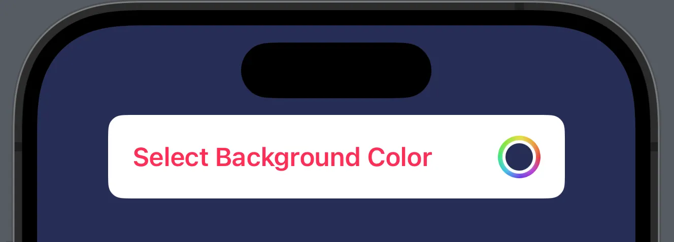
The image above shows the maximum level of customization possible — and at the same time its biggest limitation: the only clickable area remains the small color circle on the right. Standard modifiers cannot change this.
The solution sounds like a hack — and it is, but an elegant one.
The Idea
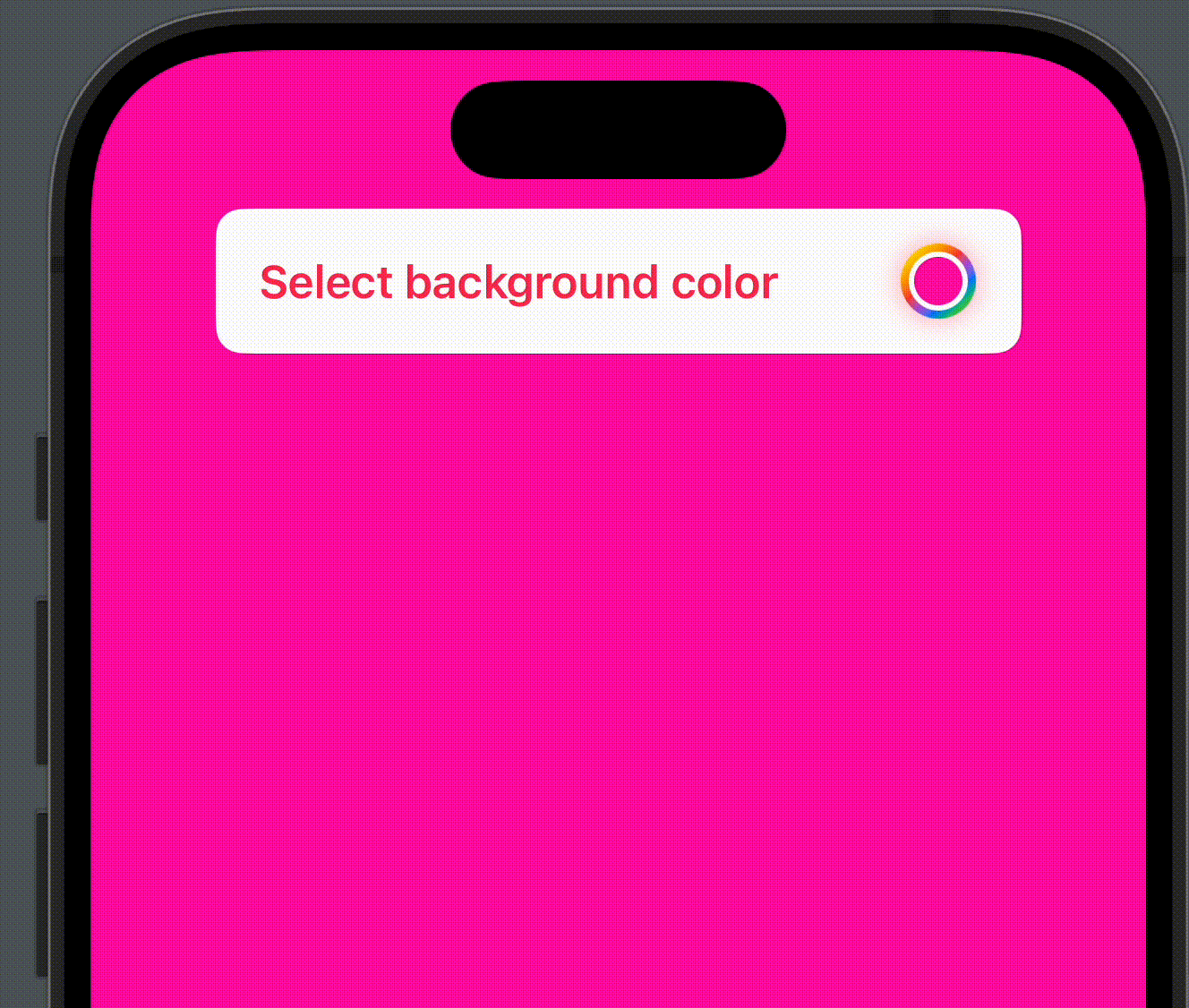
A freely styled button serves as the visible surface. On top of it sits an invisible ColorPicker, stretched to cover the same area. The user clicks the button but actually hits the invisible ColorPicker underneath, and the color selection sheet opens as usual.
The Three Key Modifiers
ColorPicker("", selection: $backgroundColor, supportsOpacity: true)
    .labelsHidden()
    .blur(radius: 20)
    .scaleEffect(x: 20, y: 2)
    .opacity(0.014)
    .frame(maxWidth: .infinity, maxHeight: 50)
    .clipped()
| Modifier | What it does |
|---|---|
.labelsHidden() | Removes the automatic label view |
.scaleEffect(x: 20, y: 2) | Stretches the small color circle to match the size of the button underneath |
.opacity(0.014) | Makes the ColorPicker nearly invisible but still touchable |
.blur(radius: 20) | Blurs away the minimal remaining visibility |
.frame().clipped() | Constrains the stretched ColorPicker to the button area |
The Critical Value: 0.014
An opacity of 0.0 disables tap gestures entirely — UIKit treats the view as non-interactive. 0.01 is too low; the ColorPicker no longer responds reliably. 0.02 leaves a faint shadow visible. The value 0.014 was determined empirically: invisible enough for the eye, but just visible enough for UIKit to forward the gesture.
Optional Color Indicator
The rainbow ring on the right side of the button consists of three cascading circles — the selected color as fill, a white border, and an animated rainbow gradient:
Circle()
    .fill(backgroundColor)
    .background(
        Circle().stroke(.white, lineWidth: 4)
            .background(
                Circle()
                    .stroke(LinearGradient(
                        colors: [.yellow, .orange, .red, .purple, .blue, .green],
                        startPoint: .topLeading,
                        endPoint: .bottomTrailing), lineWidth: 10)
                    .rotationEffect(.degrees(rotation))
                    .animation(.linear(duration: 2)
                        .repeatForever(autoreverses: false), value: rotation)
                    .onAppear { rotation = 360 }
            )
    )
    .frame(width: 18, height: 18)
Three circles nested inside each other, the outer one rotating endlessly. The result looks like a professional color wheel button — even though technically it is just a stack of three .background() modifiers.
Complete Example
The full button consists of three layers: text on the left as the visible surface, the color indicator on the right, and the invisible ColorPicker as an overlay on top of everything.
struct PickerBootCamp: View {
    @State var backgroundColor: Color = .pink
    @State private var rotation = 0.0
    let rainbowColors = [Color.yellow, .orange, .red, .purple, .blue, .green]

    var body: some View {
        ZStack {
            backgroundColor.ignoresSafeArea()
            VStack {
                HStack {
                    Text("Select background color")
                        .font(.headline)
                        .foregroundColor(.pink)
                        .padding(.horizontal)
                        .frame(maxWidth: .infinity, alignment: .leading)
                        .overlay(
                            HStack {
                                Spacer()
                                Circle()
                                    .fill(backgroundColor)
                                    .background(
                                        Circle().stroke(.white, lineWidth: 4)
                                            .background(
                                                Circle()
                                                    .stroke(LinearGradient(
                                                        colors: rainbowColors,
                                                        startPoint: .topLeading,
                                                        endPoint: .bottomTrailing),
                                                        lineWidth: 10)
                                                    .rotationEffect(.degrees(rotation))
                                                    .animation(.linear(duration: 2)
                                                        .repeatForever(autoreverses: false),
                                                        value: rotation)
                                                    .onAppear { rotation = 360 }
                                            )
                                    )
                                    .frame(width: 18, height: 18)
                                    .padding(.trailing, 6)
                                    .padding()
                            }
                            .overlay(
                                ColorPicker("", selection: $backgroundColor,
                                            supportsOpacity: true)
                                    .labelsHidden()
                                    .blur(radius: 20)
                                    .scaleEffect(x: 20, y: 2)
                                    .opacity(0.014)
                                    .frame(maxWidth: .infinity, maxHeight: 50)
                                    .clipped()
                            )
                        )
                }
                .frame(maxWidth: .infinity, minHeight: 54)
                .background(.white)
                .cornerRadius(10)
                .shadow(color: .gray.opacity(0.2), radius: 10)
                Spacer()
            }
            .frame(width: 300)
        }
    }
}
No UIKit, no UIViewRepresentable — pure SwiftUI with a clean overlay and a carefully calibrated opacity value.
Sometimes the most elegant solution is a well-disguised hack, and as long as it works and remains readable, there is nothing wrong with that.
Translated with the help of Claude