Four SwiftUI Layout Patterns That Belong in Every Project
Originally published on Medium: LazyHGrid (July 2024), Collapsible Sections (December 2024), TabGesture (July 2024).
SwiftUI has more layout power than most tutorials show. Here are four patterns I use regularly — each solving a specific problem.
1. LazyHGrid with Pinned Section Headers
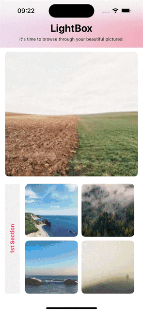
Horizontal scrolling with pinned category headers is ideal for image galleries, media libraries, or horizontal product catalogs.
The challenge: section headers in a LazyHGrid are rendered horizontally by default, meaning the text runs left to right instead of top to bottom. The solution is a 270-degree rotation with negative padding to position the header correctly:
ScrollView(.horizontal, showsIndicators: false) {
    LazyHGrid(
        rows: [GridItem(.flexible()), GridItem(.flexible())],
        spacing: 10,
        pinnedViews: .sectionHeaders
    ) {
        Section(header:
            Text("Kategorie A")
                .rotationEffect(Angle(degrees: 270))
                .padding(.trailing, -125)
                .padding(.leading, -130)
        ) {
            ForEach(0..<10) { index in
                AsyncImage(url: imageUrl) { phase in
                    if case .success(let image) = phase {
                        image.resizable()
                            .frame(width: 145, height: 145)
                            .clipShape(.rect(cornerRadius: 10))
                    }
                }
            }
        }
    }
}
The padding values (-125, -130) are empirical and depend on the header width. It does not look elegant in code, but the UI fits exactly.
Custom Navigation Bar with SafeAreaInset
The standard toolbar rarely matches your own design. The .safeAreaInset modifier replaces it with a freely customizable view with a blur effect:
.toolbar(.hidden, for: .navigationBar)
.safeAreaInset(edge: .top) {
    SafeAreaView(screenTitle: "Gallery",
                 screenSubtitle: "Browse your pictures")
}
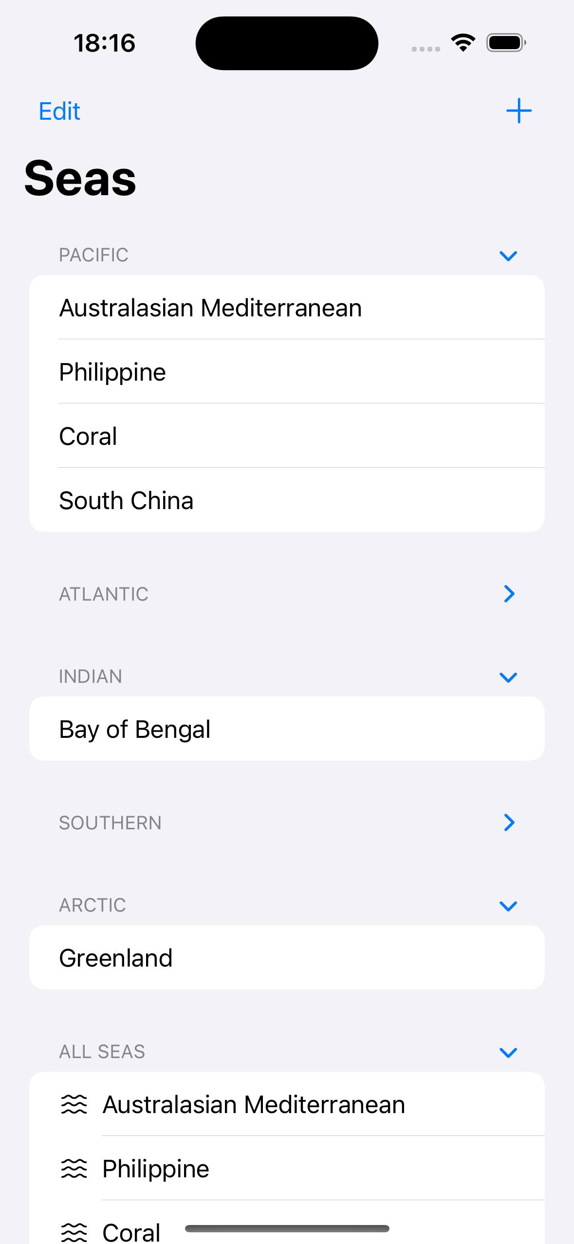
2. Collapsible List Sections (iOS 17+)
Since iOS 17, Section supports the isExpanded parameter as a Binding<Bool>. Combined with .listStyle(.sidebar), this creates collapsible sections without any additional libraries.
Simple Variant with a Bool
@State private var isExpanded = true

List {
    Section(isExpanded: $isExpanded) {
        ForEach(items) { item in
            Text(item.name)
        }
    } header: {
        Text("Section Title")
    }
}
.listStyle(.sidebar)
Dynamic Variant with Set
When you have a variable number of sections, a single Bool is no longer sufficient. Instead, a Set<String> manages the state of all sections simultaneously:
@State private var expanded: Set<String>

init() {
    _expanded = State(initialValue: Set(regions.map { $0.name }))
}

Section(
    isExpanded: Binding<Bool>(
        get: { expanded.contains(region.name) },
        set: { isExpanding in
            if isExpanding { expanded.insert(region.name) }
            else { expanded.remove(region.name) }
        }
    ),
    content: { /* ... */ },
    header: { Text(region.name) }
)
The manual Binding<Bool> may look cumbersome at first glance, but it is the clean approach — no array of Bools, no index matching, and no off-by-one errors.
| Variant | State type | Suitable for |
|---|---|---|
| Simple | @State Bool | Fixed number of sections |
| Dynamic | @State Set<String> | Variable number of sections |
3. Star Rating with Mask Modifier
The .mask() modifier clips a view into the shape of an image. This lets you build a star rating with partial fill — entirely without custom drawing or Canvas.
The technique works by layering two rectangles — gray as the background, yellow as the fill — both masked with SF Symbol stars:
ZStack {
    Rectangle()
        .fill(.gray)
        .frame(width: 136, height: 20)
        .overlay(
            HStack {
                Rectangle()
                    .fill(.yellow)
                    .frame(width: CGFloat(starValue), height: 20)
                Spacer(minLength: 0)
            }
        )
        .mask(
            HStack {
                ForEach(0..<5) { _ in
                    Image(systemName: "star.fill")
                        .resizable()
                        .frame(width: 20, height: 20)
                }
            }
        )
}
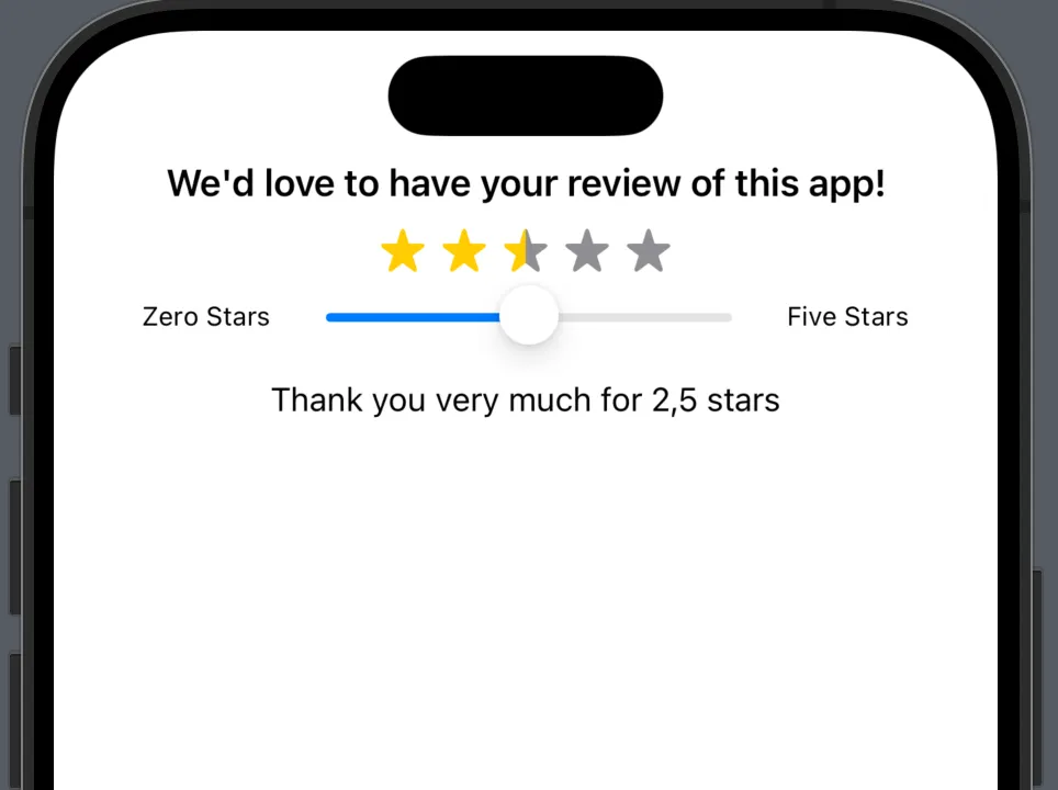
The yellow area grows proportionally with the slider value, and the mask clips both rectangles into star shapes. A slider controls the value:
Slider(value: $starValue, in: 0...136, step: 4.25)
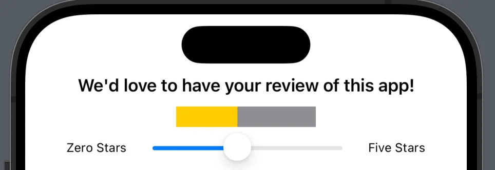
No path drawing, no computational overhead — five SF Symbols as a mask are all you need.
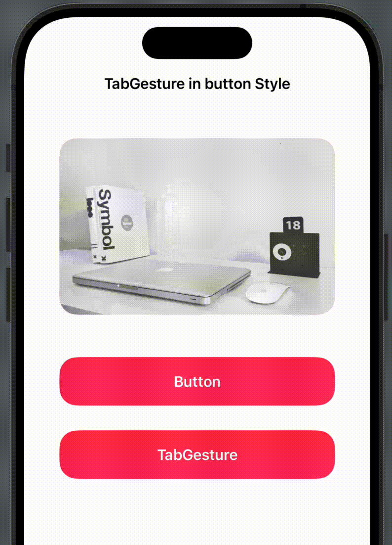
4. Tap Gesture with Button Feedback
onTapGesture unlike Button provides no visual feedback. There is no press state and no opacity change, which means the user taps and sees nothing happen visually, even though the action runs in the background.
The fix is a manual opacity animation using DispatchQueue.main.asyncAfter:
@State private var addOpacity = false

Text("Action")
    .frame(height: 55)
    .frame(maxWidth: .infinity)
    .background(.pink)
    .foregroundColor(.white)
    .cornerRadius(20)
    .onTapGesture {
        action()
        addOpacity.toggle()
        DispatchQueue.main.asyncAfter(deadline: .now() + 0.1) {
            addOpacity.toggle()
        }
    }
    .opacity(!addOpacity ? 1.0 : 0.1)
    .animation(.easeInOut(duration: 0.1), value: addOpacity)
The flow is simple: on tap, the opacity drops to 0.1. After 100 milliseconds it jumps back to 1.0, and .animation(.easeInOut) smooths the transition. The result feels like a native button press.
This pattern is useful whenever Button styling does not fit, when you want to use Text or Image directly as interactive elements, or when you are already working within an onTapGesture chain.
Four patterns, four specific problems solved.
Translated with the help of Claude