SwiftUI Picker — Why Menu Has the Better Label
Originally published on Medium: Setup SwiftUI Picker with a label (July 2024) and Create Generics Enum PickerView (January 2025).
The SwiftUI Picker with .inline style has a peculiar problem: you give it a label, and it shows a chevron instead.
The issue is well known and frustrating. PickerStyle.inline completely ignores the label and displays a lonely arrow without any context instead of the description. Apple’s own documentation says nothing about it.
Picker(selection: $gender) {
    Text(Gender.male.rawValue).tag(Gender.male)
    Text(Gender.female.rawValue).tag(Gender.female)
    Text(Gender.nonbinary.rawValue).tag(Gender.nonbinary)
} label: {
    Text("Select your Gender")
}
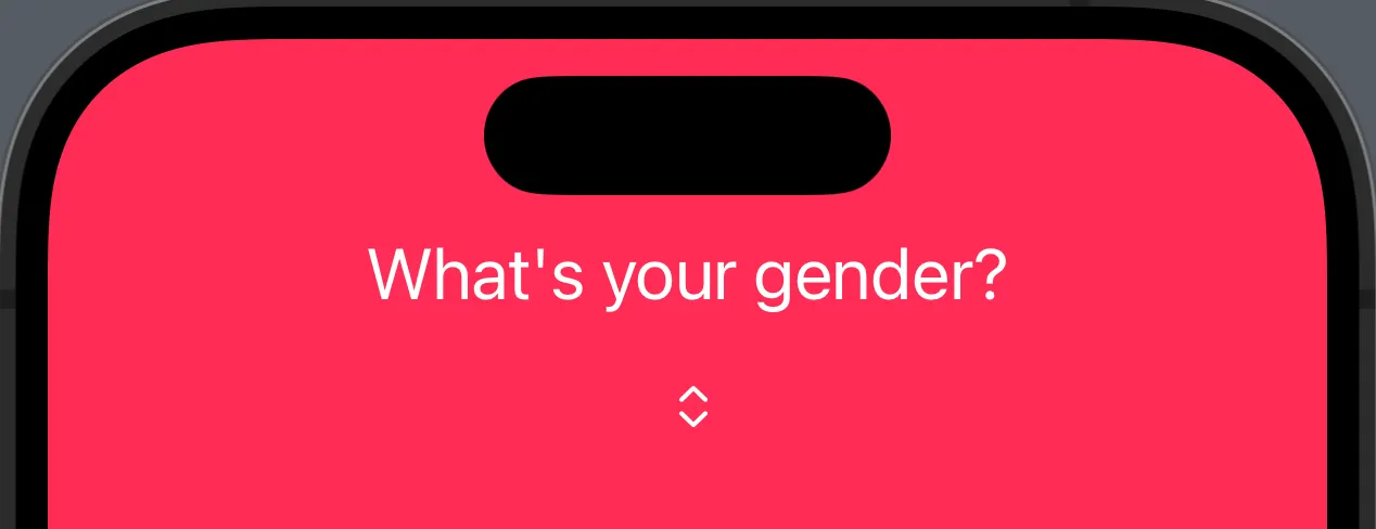
The label is declared but never displayed. The user only sees the chevron and has to guess what it stands for.
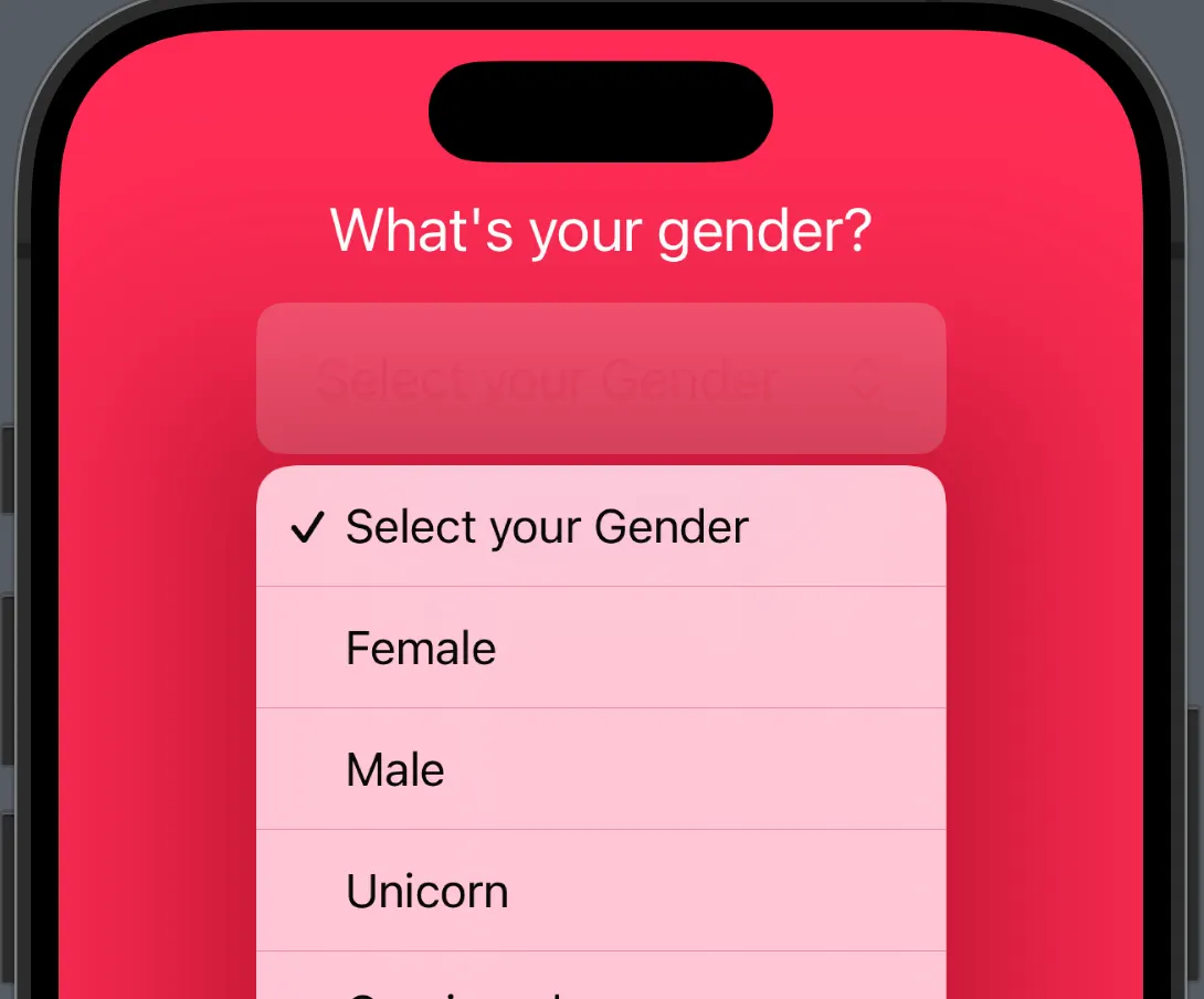
The Solution: Menu as a Wrapper
If you want a menu, you should actually use a menu. The Menu view takes the Picker as its content, and the label can be freely styled.
Menu {
    Picker("", selection: $gender) {
        ForEach(Gender.allCases) { data in
            Text(data.rawValue).tag(data)
        }
    }
    .pickerStyle(.inline)
} label: {
    HStack {
        Text(gender.rawValue)
            .font(.title3)
            .frame(maxWidth: 200)
        Image(systemName: "chevron.up.chevron.down")
            .padding(.trailing)
    }
    .frame(maxWidth: .infinity)
    .frame(height: 55)
    .background(.white)
    .cornerRadius(10)
    .accentColor(.pink)
}
| Aspect | Inline Picker | Menu Wrapper |
|---|---|---|
| Label visible | No, only a chevron | Yes, and fully customizable |
| Tappable area | Only the chevron itself | The entire button area |
| Styling | Heavily restricted | Full SwiftUI modifiers |
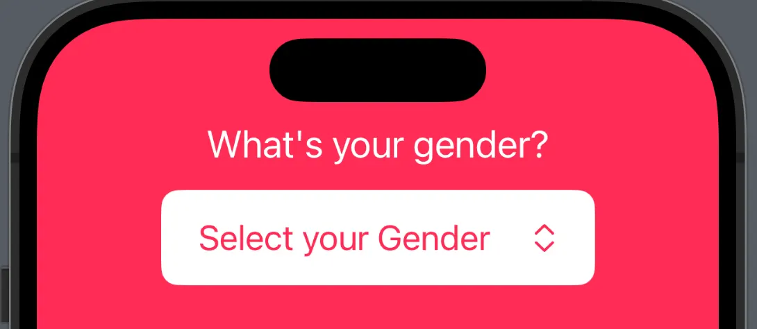
The entire button area is now tappable, the label shows the current value, and the menu opens cleanly as an inline sheet.
Bonus: Generic Enum Picker
With three pickers in the same form, the code quickly becomes redundant. The solution is a generic PickerView that works with any conforming enum.
The Protocol
protocol PickerEnum: Hashable, CaseIterable {
    var stringValue: String { get }
}
The View
struct GenericPickerView<S: PickerEnum, Label: View, Content: View>: View {
    let selection: Binding<S>
    let label: Label
    @ViewBuilder var content: (S) -> Content

    var body: some View {
        Picker(selection: selection, label: label) {
            ForEach(S.allCases, id: \.self) {
                content($0)
            }
        }
    }
}
Usage
List {
    GenericPickerView(
        selection: $direction,
        label: Text("Direction"),
        content: { Text("\($0.stringValue.capitalized)").tag($0) }
    )
    GenericPickerView(
        selection: $orientation,
        label: Text("Orientation"),
        content: { Text("\($0.stringValue.capitalized)").tag($0) }
    )
}
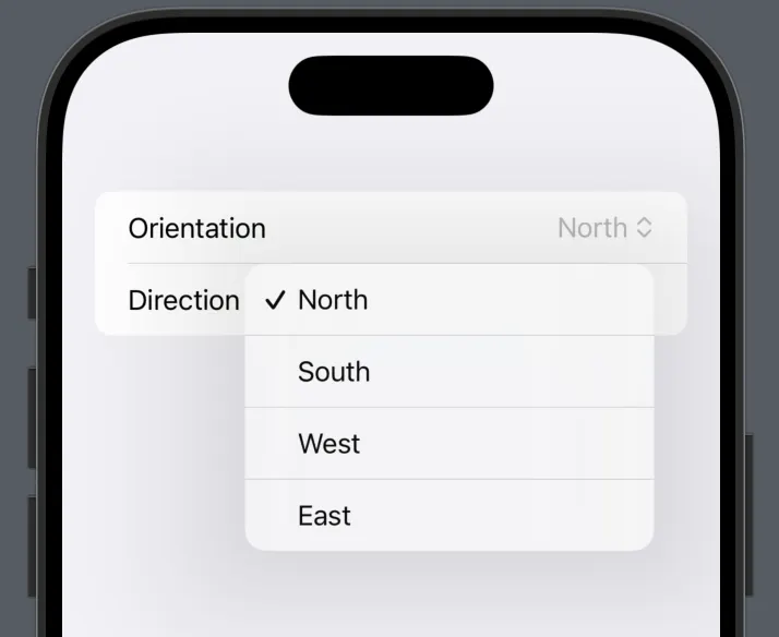
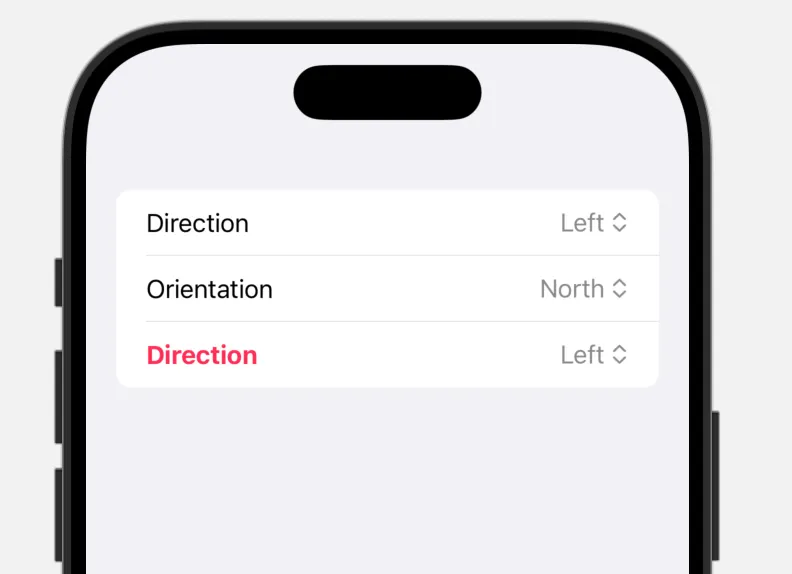
Two pickers, zero redundancy. Need a new enum? Just conform to PickerEnum and you are done.
The RandomAccessCollection Pitfall
CaseIterable.AllCases does not automatically conform to RandomAccessCollection, which causes a compiler error when used in ForEach. There are three clean ways to solve this:
| Variant | Assessment |
|---|---|
ForEach(Array(S.allCases), id: \.self) | Works, but creates an array cast on every render |
where S.AllCases == Array<S> on the struct | Explicit and safe |
where AllCases: RandomAccessCollection on the protocol | Defined once, valid everywhere |
The third variant is the cleanest because the constraint is defined directly on the protocol and does not need to be repeated on every view.
Two patterns that belong in every SwiftUI project: Menu instead of inline Picker, and Generics instead of copy-paste.
Translated with the help of Claude